

As the saying goes, “Change is the only constant in life.” To follow suit, in 2018, we digital marketers will switch our strategies to target a mobile-first indexing. What does this mean for your website? Hopefully not much if you’ve been making consistent updates to your website!
A Little Mobile Search History
On April 21, 2015, Google performed an algorithm update that has since become known as “Mobilegeddon.” The update was intended to decimate the rankings of any site that was not mobile friendly. The announcement prior to the update caused a frantic rush to update websites across the world, but in the end, it proved to be a scare tactic by Google to improve user experience on mobile devices. Fast forward three years and we find ourselves in a similar situation, with Google announcing their mobile first indexing. While there is certainly less panic this time around, the mobile sentiment remains the same; make your mobile site as user-friendly as possible.
What is Mobile First Indexing?
The Mobile first index simply means this, when Google crawls your website, they will crawl your mobile site first (with Googlebot Smartphone) followed by your desktop site. They will also crawl your mobile site more frequently than your desktop site. Google will be looking for differences in user experience between your mobile and desktop sites. If you have separate mobile and desktop sites, it is important to pay close attention to creating a similar user experience on both platforms. Differences can send a signal to search engines that the user experience is lacking, and your site could begin to slip on search engine results pages.
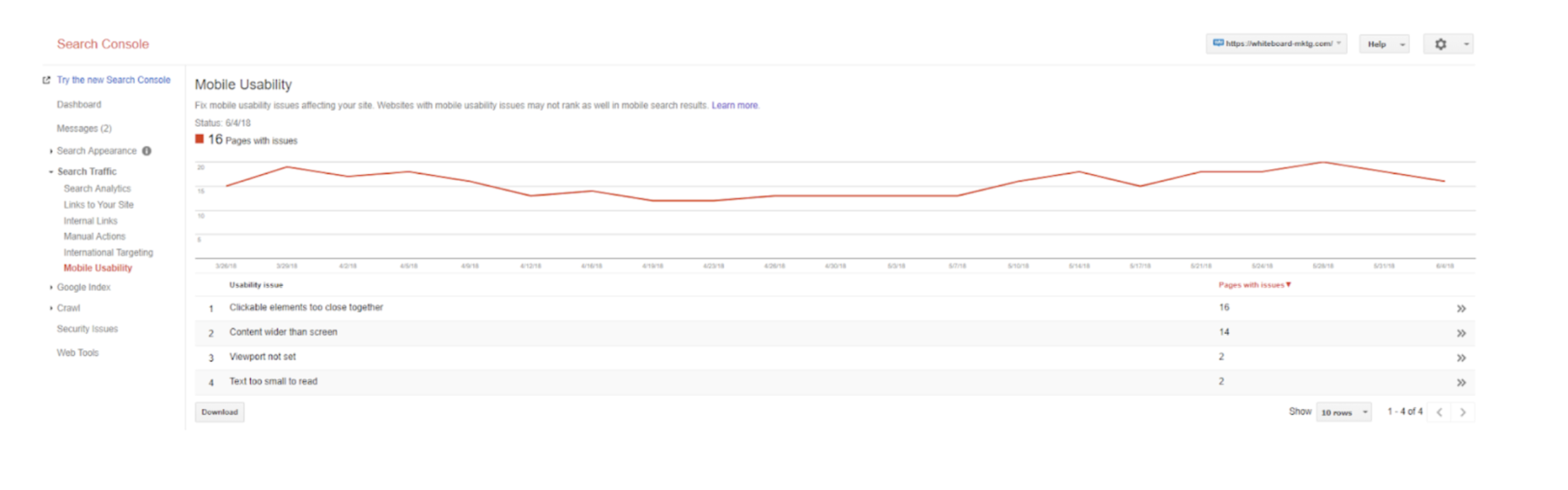
The mobile first indexing change will take place gradually according to Google. It has already begun with sites that Google has deemed ready for the switch. Other sites that are less ready will slowly be included in the change, presumably between now and October. Below is a sample of the notification being sent by Google in Search Console.
Why is Google Switching to Mobile First indexing?
- Mobile internet traffic has now reached over 60%, surpassing desktop internet traffic which declined to 40%. *Users are searching more on mobile than desktop. (Source: CNET)
- 60% of global mobile consumers use their mobile device as their primary or exclusive internet source (Source: Internet Retailer)
- 95% of smartphone users have used their phone to look up local information. After doing so, 61% called and 59% visited. (Source: Forbes)
- 53% of mobile users abandon websites which take longer than 3 seconds to load. (Google DoubleClick Study)
‘Nuff Said.
Steps to Ensure My Website Benefits from Mobile First Indexing
If you have already made the switch to responsive design, as Whiteboard Marketing has for our clients, you are halfway there. With a responsive design, you ensure a similar user experience for both mobile and desktop users. Consistency, transparency, and speed are the keys with Google. Below are seven points for consideration to confirm you are ready for the change:
- Switch to a Responsive Website Design.
- Run the good old Google mobile-friendly test
- Check the mobile usability feature in Google Search Console


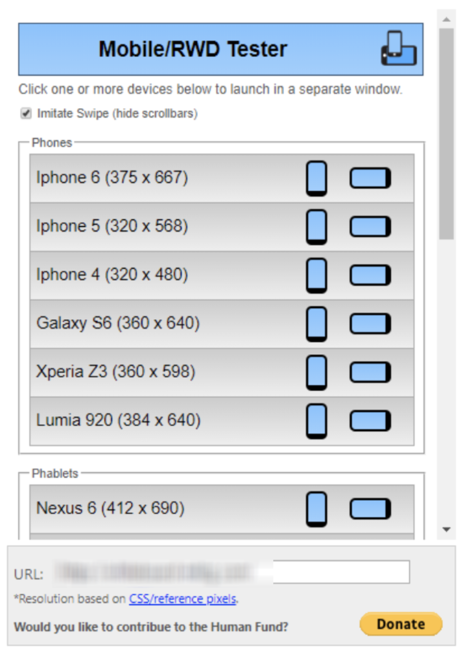
- Download a plugin like “Mobile/Responsive Web Design Tester” for Chrome, and test different screen sizes
- Update Your CMS version and CMS themes, especially if you have a responsive site and issues come up in Google Search Console. CMS themes are constantly improving
- Run Google Page Speed Insights and follow the suggested updates!
- Run a standard speed test on a site like Pingdom and make sure your load time is under 3 seconds!
Conclusion
As with any Google algorithm update, if you are providing the right experience for your users, you should see a rise in organic search position. Google has provided us with ample time to make the necessary adjustments to websites that lack a positive mobile user experience. There are no real secrets to this update, just follow the seven steps above. However, if you want a little more help or just want to make sure your website is fully prepared for the change, give Whiteboard a shout.
Contact us at info@whiteboard-mktg.com or (614) 945-4757.